

Toolshare Mobile App
Academic + Passion Project
Brief
Design a community app where tools can be shared between neighbors
Role
UX/Product Designer
Timeline
8 weeks
Tools


Problem
Tools can be purchased and rented, but there are occasions when an expensive tool is only needed once or inexpensive tools are not necessary to own. And then, times a store is an inconvenient drive away, or out of stock or frustrations tracking down a sales clerk for help.
Insights
Through an in-depth competitive analysis, I discovered a sense of security was the top concern among users with apps like Lend Me It. It was identified that the terms and conditions were an extremely important part of the onboarding process for new users. I also uncovered during interviews that some pain points were inconvenience (learning a new tool or commuting to store), limited connection to community, and lack of resources to finish more projects.
Solution
The final solution was a mobile app that connects neighbors with tools and features like a feed, search, uploading photos, favorites, user account, reviews, scheduling and booking, messaging, specifications, tutorials, and terms & conditions.
Research
Competitive Analysis

I found that Mooch, TradeMade, Lend Me It were the top three competitors with Lend Me It being top competitor because they provided all the features.
I saw an opportunity to provide additional features, a sense of accomplishment and motivation with tutorials and photo sharing within the community.
Research
Persona + User Journey

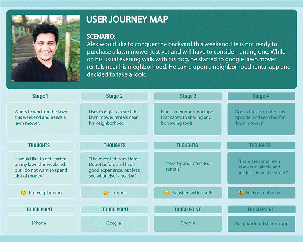
Understanding the consumer and target audience was the next part of research. Walking through Alex’s situation helped me understand his thought process and the need for a community tool sharing experience.
With a target audience defined, it was time to get some feedback from real people based on the persona’s criteria.
Research
Interviews


Matthew
Student, 22
Jake
Sales Clerk, 32
Todd
Dept. Manager, 54
Criteria
Ages between 25-50, tech savvy, uses social media, and an interest in home improvement or DIY projects
People
I reached out to 3 people in my network that matched the criteria. Matthew, a student, Jake, a sales clerk at a pawn shop, and Todd, a department manager in retail.
Interview
I conducted one interview in person, one over a phone call, and one through video chat.
I wanted to find out where they were getting their tools, a situation when they needed a specific tool and did not have it, what did they do, and what makes a great app to them.
And also, what would convince them to use a community app that allowed the sharing of tools between neighbors.
Research
Empathy Map

Using an empathy map to further understand behaviors, emotions, thoughts, and pain points.
Pain Points
Difficulty in learning a new app (ease of use)
Time inconvenience (learn a new tool or store commute)
Cost of a tool only needed once
Hassle of locating an associate for help
Gaining trust (importance of Terms and Conditions)
Ideation
Rapid Prototype/Scenario Mapping


By mapping out the journey of searching for a lawn mower and then booking it, helped me further understand the steps to achieve this goal. I used the Marvel app to take photos of the notecards, uploading them into the platform, creating my first interactive prototype!
Analyze
User Tasks

User tasks for usability testing
TASK 1
Following the same steps Alex did, who was planning on working in their yard over the weekend and needed a push lawn mower. They used the app to search nearby and to find the right tool to borrow.
TASK 2
The second task was for someone who loaned out their ladder, but suddenly needed it back. They have to contact the user that is currently borrowing it and request it back.
Testing
Observations
After conducting usability testing with 4 different people over video chat, I had observed that they either quickly navigated or were confused by an element or icon.
In the next iteration, I will use more universal elements and icons.
Design
High-Fidelity Wireframes
The notecard prototype was the final part of the class assignment.
I wanted to learn prototyping in Figma, so I continued with the process. I used Figma to build the high-fidelity wireframes and interactive prototype, highlighting some of the product’s features.

I wanted to experiment with a dark mode UI, try something different for this mobile app.

For the Feed, Results, and Favorites pages I created containers for content, using low and high contrast. I also chose more universal looking icons on the bottom navigation

And I added a fun and familiar feature for the mobile experience by creating a swipe animation on the favorites page using smart animate in Figma.
UI Feedback
UX Facebook Group

I posted this image in a UX Facebook group to get some feedback on the UI.

One member mentioned considering a social login option

Another suggested creating a mockup photo instead of using a stock photo, some of the users might be using the camera to take photos of the tool in their environment and uploading it directly.
Two commented on decreasing the spacing between the results.

Reminder to not forget the page indicator for the icons, (choose a different color and add a line for accessibility).
Summary
Takeaways
What I learned is that I need to spend more time developing my target audience. To conduct more interviews since I only did 3 user interviews. Ask for UI feedback earlier in process, perhaps share and ask for feedback on a design system. And I would like to follow through designing all features that I had mentioned in the beginning, implementing them into the prototypes.
Reflection
If I had more time I would include the rest of the features that I wanted to include (tutorials, reviews, messaging, interactive map, scheduling & booking). I would consider and implement the UI feedback from the Facebook group. It is important to check the colors and follow WCAG guidelines in the beginning when choosing the color palette.
I would also like to learn more about Terms & Conditions, and what that means for this app. And conduct user testing for the next iteration that includes all the changes.